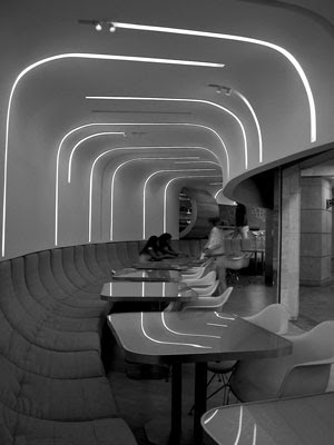
 Cold Cathode lighting
This lighting lamp is very interesting in this dining space. The reflectivity o the tables gives your mind the illusion of a continuing line. The narrowness of the lamp keeps it from being too bright and overpowering the space. I think this space is extremely successful.
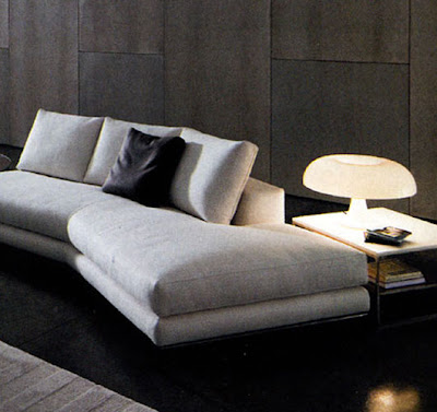 Incandescent lighting
 Incandescent lighting
This home image of incandescent lighting is something that we are very used to seeing. This light is being joined by natural light also, but it still seems like it emits an appropriate amount of light for the space. It creates a soft glow on the couch and a slightly harsher bright glow on the table. Great spot for reading! : )
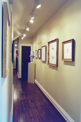 Halogen lighting
 Halogen lighting
This hallway is lined with studio track lights that have halogen lamps. For a hallway, the space seems a bit bright and the style of the lights seem a little bit out of place in this setting. The country wood and classic picture frames collide with the institutional bright lights and make for a relatively awkward space.


